
An Exploration of Responsive Design
by Justin Vandenberg
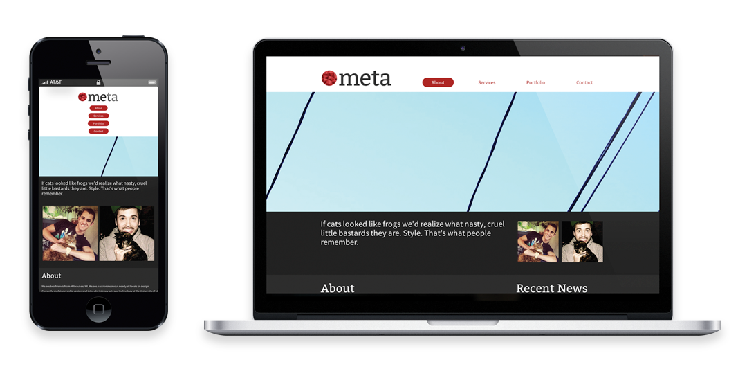
The way that we interact with the Internet is changing – we are spending less time behind computer screens and more time flicking through pages on our mobile devices. This shift in platforms has exposed several issues with many of the websites on the internet – the main issue being usability. These days, mobile devices come in all shapes and sizing, meaning that their viewports do not have consistent dimensions and resolutions. Responsive web design was developed to counter this unpredictability. The goal of responsive design is to create a website that seamlessly adapts to it’s viewing environment. Maintaining an attractive product while still preserving usability is the key to good responsive design. The Meta website is my attempt experiment and, hopefully, create a website that does this across most platforms.
Please, try to contain your excitement… It’s time for some technical jargon. The website is developed using the HTML5, CSS3, jQuery, and PHP languages. Using CSS media queries, the website automatically detects the size of the browser window. The website has three size declarations (media queries) using the most common device sizes. In between these ‘break-points’ the components of the webpage scale to maintain uniformity. All of the back end work is important, but the creative work is what the visitors will (most importantly) see. Being a design portfolio website, aesthetics are what will interest the visitor, therefore it was important for me to spend a good amount of time on the visual aspects. After pulling all of these things together, I hope to have created an appealing and universally accessible website.
Follow Me!